The best product managers rely on data to inform decisions, learn from the past and plan ahead. Many opt to use some sort of dashboard as their first port of call. But, while dashboards are useful tools to keep a high-level eye on product performance, they also tend to be built to answer fixed sets of questions. Typical dashboards track numbers like user growth or daily revenue, or standardized breakdowns like installs per region or average revenue per user. These are essentially surface questions, meaning they tell you what’s happening on the surface of the product. To ask deeper questions (usually why things happen rather than if they happen) generally requires data processing and analysis. A dedicated analyst can help to answer some of those deeper questions, but it’s generally good practice for product managers to be able to do some of their own analysis too. Sometimes you’re not quite sure what you want to ask, for example. Sometimes the act of digging in the data can lead to questions that you hadn’t thought to ask. Doing your own digging will also help you gain familiarity with your players’ behaviors, game performance drivers, and a more holistic understanding of the services you manage. Where should you begin? Data analysis broadly requires that you have some familiarity in the following areas:
- A working knowledge of SQL, Python, R or similar tools
- What data is available
- How it is collected
- Common pitfalls of analysis and statistics
Although it depends on what system your company uses to collect and manage data, there are numerous online and book resources available to learn SQL, Python and other data analysis languages. They are broadly no more complicated to understand than any in-depth knowledge of spreadsheets or other data systems, and a few simple lessons that open up a wealth of possibilities. (For more, here is an hour-long video about getting started in SQL) Similarly, knowing what data is available and how it is collected is probably a matter of reading documentation and speaking with the developers who implemented the system for your game (unless of course you’re the one who implemented it). Generally speaking most analytics packages are very flexible in the kinds of data they can draw, as long as developers can update both game and analytics packages to listen for the correct events. It never hurts to ask what data is available, or what could be available. Probably the most important areas of analysis, however, are common pitfalls. These are typical sets of assumptions and mistakes that those new to analysis often make, and which lead them to draw the wrong conclusions from their data. Avoiding these pitfalls is what we hope to teach you in this article.
Common Pitfalls
When engaging in data analysis, inexperienced analysts typically make one or more types of mistake, including:
- Selection bias
- Statistical significance
- Correlation/Causation confusion
- Absolute versus Normalized datas
- Cannibalization
Let’s go through them. To do so we’ll begin with a hypothetical pricing experiment on a “starter pack” for “Game X”, meaning an offer shown to new players intended to incentivize them to purchase in-game goods and habituate them to the idea that purchasing is worthwhile. In Game X the starter pack is currently priced at $1.99, and the question we would like to ask is whether a new price point of $1.49 would optimize conversion and revenue. So we run an experiment on two equally sized populations of newer players (“cohorts”) to see how they behave when shown one of two packs (also known as an A/B test). We run the experiment for two weeks in order to collect a substantial amount of data, and after the experiment is complete, we obtain the following data:
| Cohorts | Population | Purchasers | Conversion | Revenue |
|---|---|---|---|---|
| Control: $1.99 | 117000 | 810 | 0.69% | $1611.9 |
| Variant: $1.49 | 117000 | 1000 | 0.85% | $1490 |
Starter pack experiment, Game X
We’ll use this data to ask some questions about selection bias and statistical significance, and go from there.
Selection Bias
Wikipedia tells us that selection bias is “the bias introduced by the selection of individuals, groups or data for analysis in such a way that proper randomization is not achieved, thereby ensuring that the sample obtained is not representative of the population intended to be analyzed”. In other words that your data and results may not be reliable because the method of collecting samples is inadvertently tilted or filtered. This can happen for any number of reasons, such as built in assumptions about how players behave through to faulty methods of data collection. Nevertheless, if present, selection bias can ultimately lead to faulty conclusions. So avoiding selection bias starts with clear thinking to identify key assumptions and remedy them. For example, our experimental data (see above) might seem pretty simple to work with, but in fact there are several questions to clarify before you begin analyzing it. Questions like these are often called “selection considerations”. Their purpose is to weed out sources of selection bias (and general noisiness in data), usually by more closely defining who is to be included in the experiment and why. Not identifying selection considerations can seriously skew your results. For example in the above experiment you could end up including all non-purchasing players in your cohorts, regardless of other factors, but that wouldn’t lead to useful results. They would likely include players who have seen the current starter pack (and perhaps other offers), as well as players who have been playing for a long time and just never bothered to buy anything in the game. Both of these types of player would likely have very different behavior patterns than the newer player whose behavior we want to analyze, and thus muddy any data we collect. So what selection considerations should we ask for this experiment? Some examples include:
- Has the player previously seen (and presumably, declined) an existing ‘starter pack’ offer?
- Are our two player populations truly representative of the overall game population? (i.e. demographics, known past behavior, otherwise typical play patterns)
- Are our experiment participants free of other behavioral interference? For example are they also participating in other experiments that could impact purchase behavior?
As you can see, even asking these questions leads us to a clearer sense of who belongs in our cohorts. The players we want to test are those non-purchasers who have not seen current or prior offers (including starter packs), who install Game X only after the period of the experiment has begun, and who are not a part of any other tests. That might be much more of a mouthful to define, but specificity helps avoid selection bias. Once we have clearly identified our selection considerations, we can proceed to define “selection criteria” (essentially the rules by which we define our data gathering) that apply to the data or its collection method. It can be a little tough, but try to make sure that the criteria you identify can be stated definitively as this makes them easier to code. In the case of our Game X experiment, we’re looking for players who:
- Are fairly new (perhaps seven days)
- Have not seen a previous starter pack offer
- Are not part of another test
- Are randomly selected across regions, ages and demographics
These criteria should give us reliable cohorts of players from whom we can draw good data.
Statistical Significance
Statisticians rely on probability analysis to determine the likelihood that a conclusion is accurate. The less data you have in a given set of results, the more volatile (how often individual results stray from the average) those results are likely to be. To understand whether this is the case, they often use “Bayesian analysis” (a technique that has existed since the 1700s). Bayesian analysis calculates the chances that one set of results could outperform another, with the idea that until there is virtually no chance of this happening you can’t be confident in your results. In other words it figures out whether you need more data to be sure. The math behind Bayesian analysis can be pretty complicated, but fortunately you don’t need to understand it (but if you would like to, here’s a great article on the subject). Instead there are many online calculators that can do the heavy lifting for you. All you need to do is plug your numbers in, and see what comes out. Typically what you’ll be looking for in a Bayesian analysis is a high “confidence interval”, a high measure of probability that one set of results will outperform another, or more technically that a population parameter will fall between a set of values for a certain proportion of times. Usually that means you’ll want your confidence intervals to be 95% or higher, as that generally equates to a result that is “statistically significant”. For example: let’s say we want to get an early look at the behavior of our cohorts to see how things are shaping up. We draw some results and see this:
| Cohorts | Population | Purchasers | Conversion |
|---|---|---|---|
| Control: $1.99 | 11,700 | 40 | 0.34% |
| Variant: $1.49 | 11,700 | 50 | 0.43% |
Early results
We can see the two price points for the starter pack (the current price plus our proposed variant), equal sizes of player population and some amount of purchase activity. Does this give us enough information to determine what the eventual results of the experiment are likely to tell us? Plugging these numbers into a Bayesian calculator, we see the following:
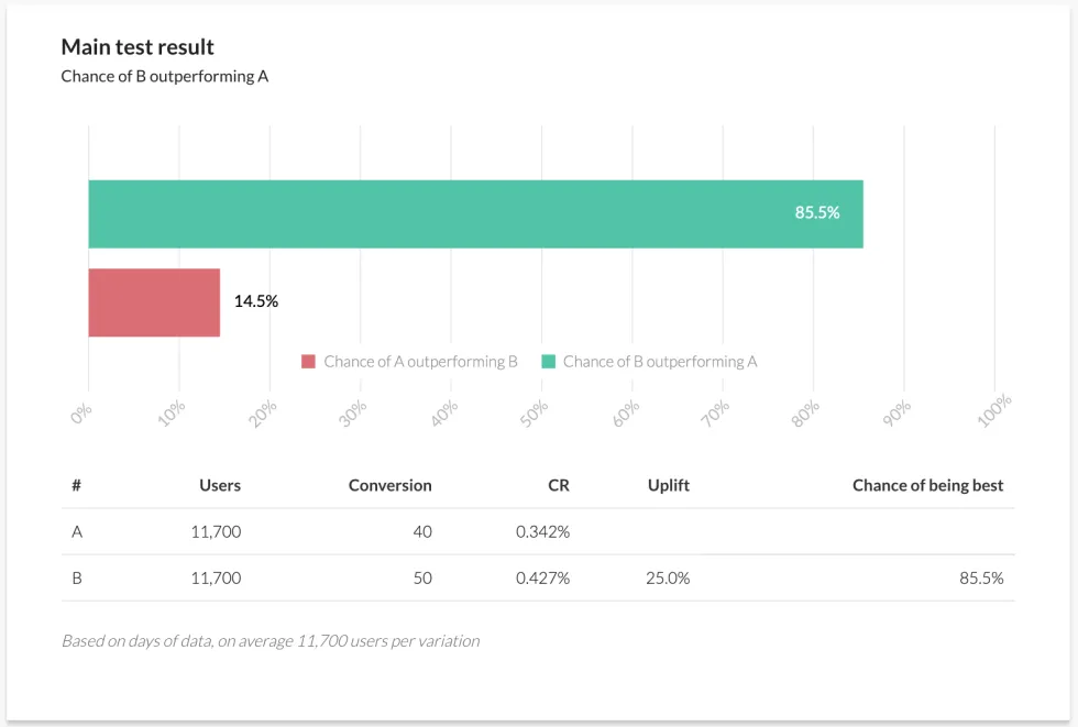
This graph shows that the likelihood that B (our $1.49 variant) will “win” the test is 85.2%. That’s its confidence interval. But it also tells us that there is a 14.8% chance that A (the original $1.99 price point) could outperform B. This is not enough to proclaim confidence in the results and means more data must be gathered to get to that 95% threshold. So we run the experiment for longer and see these results:
| Cohorts | Population | Purchasers | Conversion |
|---|---|---|---|
| Control: $1.99 | 117000 | 810 | 0.69% |
| Variant: $1.49 | 117000 | 1000 | 0.85% |
The full picture
We can see that many more players have been tested on both our price points, and we have seen more purchases of both. We can also see that conversion for both has risen over time (which may suggest we should run another experiment to determine why). Plugging this larger set of results into our Bayesian calculator, we see this:
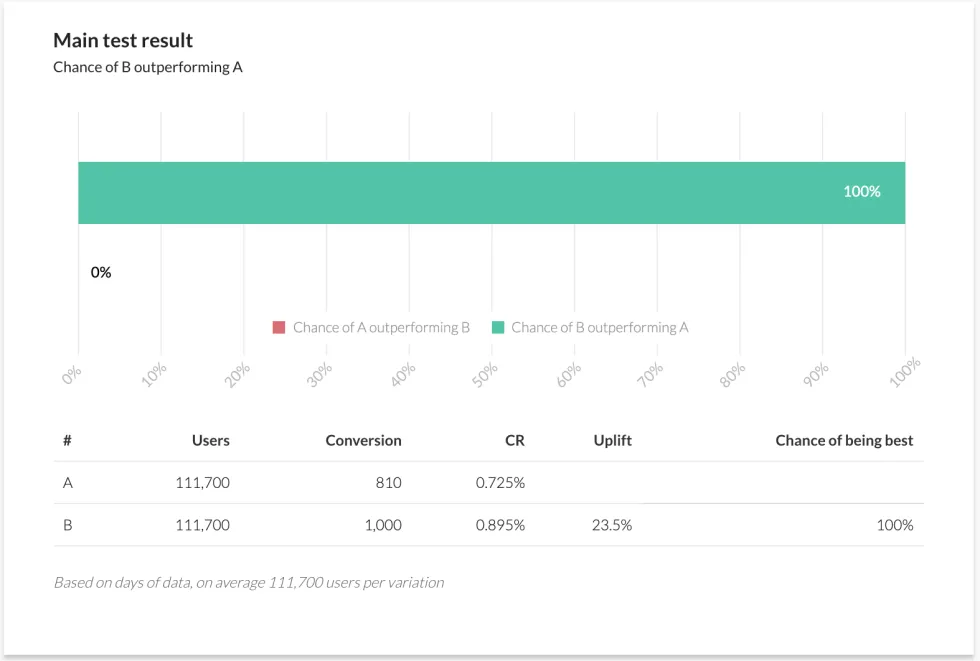
With the larger set of data, the chances of B outperforming A have risen from 85.2% to 100%. In other words a complete certainty that our result is statistically significant. While it’s reasonable to say that, in this case, the earlier result indicated that this was inevitable, it is possible that events outside the experiment could have been skewing our smaller data set and creating a false sense of inevitability. It’s always good to wait until we have real confidence before declaring a winner. Sometimes we have to consider broader implications of confidence before we make changes to a game. A result may well be statistically significant, for example, but that doesn’t automatically mean it’s the right thing to do. For example our second set of results gave us a confidence interval over 95% on the question of whether a lower price point will increase purchaser conversion for that pack. But what does that mean for overall revenue? Let’s look at our final results again, this time with overall revenue earned:
| Cohorts | Population | Purchasers | Conversion | Revenue |
|---|---|---|---|---|
| Control: $1.99 | 117000 | 810 | 0.69% | $1611.9 |
| Variant: $1.49 | 117000 | 1000 | 0.85% | $1490 |
What about revenue?
We can see our cohorts, purchases and conversion, but now also how much revenue each cohort delivered. The revenue column seems to suggest that the $1.49 variant would be bad after all, because it’s not converting enough over the $1.99 existing price point, even though it’s converting more (or in industry-speak that its consequences for ARPPU, or “average revenue per paying user”, are not good). Actually it would be a mistake to conclude that without further data. You might want to run a further analysis of each cohort’s projected ARPPU, for example, or let the experiment run longer to see how revenue develops with subsequent purchases from each cohort. For example, what if starter pack purchasers go on to buy $15.00 in follow-on purchases during their lifetime? What would the projected revenue for each cohort then be? Let’s see:
| Cohorts | Population | Purchasers | Conversion | Direct Revenue | Follow on Revenue | Total revenue |
|---|---|---|---|---|---|---|
| Control: $1.99 | 117000 | 810 | 0.69% | $1611.9 | $12,150 | $13,761.90 |
| Variant: $1.49 | 117000 | 1000 | 0.85% | $1490 | $15,000 | $16,490.00 |
The total picture (As a side note, this method would rarely be applied alone as a true analysis of revenue implications would also have to consider effects of cannibalization. See below for more.) We can see that although the initial revenue from pack conversions would drop, it would more than make up for itself in total revenue in the long run. (That said, in the case above the cohort size is only 117000. For a 0.69% base conversion, 2 variants experiment and with a 5% expected uplift in conversion, the sample size should be at least 700,000 per variant to be statistically significant. Our experiment is just a hypothetical example.) In general when assessing for statistical significance, make sure to collect data until you’re pretty sure that:
The experiment has captured a sample size both big and long enough to avoid false positives
You call the experiment in favor of one of the variants with an appropriate confidence interval (> 95%)
Correlation vs. Causation
It’s practically cliché to remind people that correlation is not causation, especially when arguing on the Internet. Nevertheless it happens to be true. When taking action on data, it’s important to understand whether the connection between the variables you are analyzing is a “correlation” relationship (meaning that the variables clearly have some kind of relationship but don’t directly impact each other), or a “causation” relationship (meaning that a change in one variable directly impacts the other). For example a rise in property crime correlates to poor economic performance in a region, but one does not directly cause the other. Rather, they are both parts of the same economic system, and mutually dependent/related in some way. On the other hand heavy rainfall in the Arizona desert and flooding of dry river beds in the region are two events in a causal relationship. The data is not merely correlated, as scientific observation has clearly determined that the rain causes the flooding (though not the other way around, obviously). Recognizing correlation vs. causation is an important skill for a data-savvy product manager. Much as with our previous discussions on selection bias and statistical significance, it’s all about being able to see through what you might feel the data is telling you versus what it’s actually telling you. Human beings often see patterns that aren’t quite true and correlate facts that don’t quite fit, and in our case this means forming beliefs about what we see happening in our games that lead us to bad conclusions. Let’s talk about some player behavior in Game X to illustrate the difference between correlation and causation. Our diligent product manager has noticed something interesting: Players who spend more than 30 minutes playing the game on day zero (the day they install the game) are ten times more likely to return to the game on day one (also known as “retention”) than those who don’t. The question is why. There are many possible answers. A thin reading might be that longer play is simply better, and imply that simple changes might dramatically affect retention, such as:
- Creating a “30 minutes played” achievement
- Altering game balance
- Revising session design to encourage longer day zero playtime
And in truth those changes might work, depending on the game and audience. More often than not, however, they wouldn’t. What if it’s not the 30 minutes of play that drives increased retention, but rather some specific activity that players do? What if the 30 minute measurement is nothing more than an indicator that the new player really, really likes the game? In that case the 30 minute measurement is merely a correlation, not a cause. Determining why players display profound differences in their pay patterns usually requires more investigating to yield meaningful results. As our product manager ponders how to leverage her discovery, for example, she needs to consider which day zero activities are likely to cause the discovery rather than correlate to it. Perhaps she discovers that there are character creation features in the game that some players spend more time in on day zero. Perhaps she also discovers that there are certain actions that players who retain seem to always take, such as engaging in with the online community earlier. But what if she then discovers that online community engagement only seems to happen for players who spend more time in character creation? That might mean that engagement with character creation is the cause of higher retention, while community merely correlates with higher retention. Poor or bad character creation might in effect be a barrier to early engagement, preventing players from really getting into the game. This is the kind of thing that experiments and data analysis can demonstrate, and through them you can prove causation. In order to do so, you must demonstrate three things:
- Association
- Time order dependency
- Non-spuriousness
Association means demonstrating that some kind of relationship exists between two events, because if there’s not even a correlation, causation is impossible. If X and Y aren’t even mildly related, there’s no chance that X can cause Y. Time order dependency means demonstrating that X must happen before Y can happen, for example that 30 minutes of play must happen on day zero before an increased likelihood of returning on day one can happen. And non-spuriousness is a fancy way of declaring that there are no additional factors at play. For example if another experiment were A/B testing large currency donations to day zero players, that would also have an impact on retention and potentially make our product manager’s observation spurious. Non-spuriousness says the relationship between X and Y are not being influenced by an unknown Z. We can use our price point experiment from earlier to illustrate this further. Basic economics teaches us that, all else being equal, a lower price will generate more conversion (the Macroeconomic “Law of Supply”). The salient point here is “all else being equal”. By designing a properly considered A/B test with appropriate criteria to avoid selection bias, and gathering enough results to achieve statistical significance, we should be able to fully isolate the price change as the only variable likely to be acting upon our cohorts. That handles the non-spuriousness requirement. If the data also shows us that there is a correlation between price and conversion behavior, that demonstrates association. And if we can show that the change in conversion happens after the change in price, then that demonstrates a time order dependency. We’ve effectively proven causation. (For some further reading: the extent to which two variables are correlated can actually be measured using something called a “correlation coefficient”. The most common type of correlation coefficient is the Pearson correlation coefficient, usually represented by “r”. You can learn more about calculating correlation coefficients here. Also for more information on experimental design and proving causation, check out this whitepaper on the subject.)
Absolute vs. Normalized Data
(Note: in this section, we discuss normalization as it applies to statistical analysis. This should not be confused with normalization as it applies to databases. Same word, different thing entirely.) One advantage of our hypothetical experiment is that both of its cohorts are equal in size (117,000). This means we can compare their results directly. However it’s often not the case that we get such equalized data, and that can lead to mistaken impressions. If, for example, one of our cohorts was only half the size of the other, then its number of purchases might appear significantly lower in a straight comparison (this is called comparing “absolute data”). Only through using ratios, such as first calculating conversion before comparing, would we see the true difference. It’s usually better to adjust data in this fashion before running a further analysis, a process known as “normalizing data”. Let’s take an example of creative testing for marketing assets, running four different ads in an A/B/C/D test to determine which one performs better. It’s difficult in such tests to collect exactly the same number of impressions for each ad, and in this case we see this:
| Creatives | Impressions | Clicks |
|---|---|---|
| Creative A | 10000 | 900 |
| Creative B | 5000 | 700 |
| Creative C | 14000 | 980 |
| Creative D | 4500 | 690 |
A/B/C/D
If we compared results using absolute data then creative C would be the winner, but that would be incorrect. Creative C got the most clicks, but also the most impressions, so comparing it to A, B and D would not be “apples to apples”. Before we compare our results we must first normalize them, in this case by creating a new metric called “Click Through Rate” (CTR). We calculate clicks as a percentage of impressions, and this shows us how often a test subject took action upon an ad that they saw. CTR accounts for the impact of higher impressions and allows us to compare “apples to apples” across all four ad variants. In the case of the above table, here’s the calculated CTR:
| Creatives | Impressions | Clicks | Click Through Rate |
|---|---|---|---|
| Creative A | 10000 | 900 | 9% |
| Creative B | 5000 | 700 | 14% |
| Creative C | 14000 | 980 | 7% |
| Creative D | 4500 | 690 | 15.3% |
Normalization!
You can see in the above example that Creative C is the least effective ad of the whole group, even though it has the largest number of impressions and clicks. Creative D, despite having the lowest number of clicks, actually converts most effectively. Of course this is a very simple example, but in most cases simple metrics such as CTR are sufficient to normalize data. There are a number of such standard metrics used to normalize through the industry, such as Cost Per Install (CPI), Click Through Rate (CTR), Installs per 1000 Impressions (IPM), Average Revenue Per User (ARPU), Average Revenue Per Paying User (ARPPU) and many more. All help you compare results of unequally-sized cohorts. By the way, don’t forget to check whether the absolute data from the above table has sufficient volume to establish a high confidence interval. Did we gather enough impressions and clicks to be sure that Creative D is the winner? Let’s look, using a Bayesian calculator that supports more than two test variants:
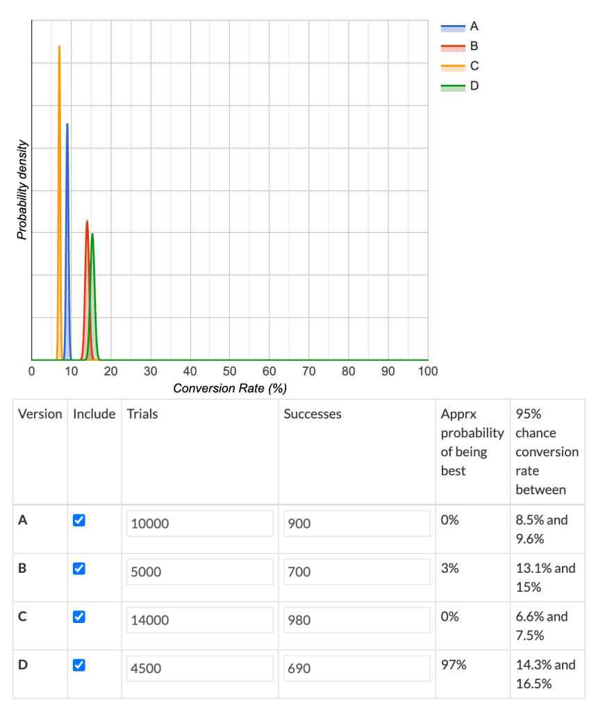
These results are presented in a different format to the calculator we previously used, but they tell a similar tale. Creative D is the clear winner, with 97% confidence. Although any eagle-eyed analyst would notice that Creative B runs pretty close in terms of its conversion rate. In this case we’d recommend further experimentation for Creative B, as with a relatively small increase in response it could prove comparable in performance to Creative D. (To find out about more complex normalization techniques, you can start here.)
Cannibalization
The fifth and final common pitfall, as we mentioned earlier, is “cannibalization”. This term describes a consequence that sometimes occurs when the introduction of a new product shifts the spending or behavioral patterns of players from old to new without any net growth gain for a game. Cannibalization can come in many forms, such as an exciting new game mode that steals players from regular modes but does not grow the overall audience, to a new set of consumable items in a game that takes spending away from existing items. In some cases, cannibalization can even reduce the total overall performance of the whole game, even if the new product is wildly successful. New price points, bundles, promotions, subscription offerings, game features and more can become poison chalices. They may seem awesome, but silently kill the underlying game. Cannibalization effects are a very common consequence of new feature rollouts, new balancing efforts and new content additions. And they can also affect statistical experiments. Going back to our hypothetical starter pack, let’s examine whether our variant offer could cause cannibalization. We already looked at how it affects revenue for the cohorts, for example, but what about its effects in the wider game? Let’s say, for example that Game X offers several bundles as part of its product mix, like:
- Our starter pack (see above)
- A monthly value pack
- A basic pack
- A premium pack
- An epic pack.
To try and determine potential cannibalistic effects in our experiment, we must first consider the conversion rate of first time buyers before and during the experiment to see whether the increased sales of the starter pack adds meaningful value, or not. We must also define what we mean by a “first time buyer”, learning the lessons of selection bias from earlier, as well as ensuring that our results are statistically significant, make some determination at separating correlation from causation, and that we normalize our data. We calculate first time buyer rate (“FTB Rate”) by taking the number of first time buyers of a given product, and dividing that by the total number of first time buyers during the period of the experiment (and so the sum value of the FTB rates should be 100%). This is also an example of normalization so it allows us to compare apples to apples, both before the experiment and during it. Assuming we do all of the above correctly, we might uncover key findings like this: